In this digital age it may be difficult to recall a time before the internet, so much of an impact has it had on our daily lives and how people do business. This is certainly true for hotels, with online booking commonplace, website listings of huge importance and an online presence essential to compete.
Anyone designing a website for a hotel will need to bear all these things in mind. Quite simply, your competition is sure to have their own site and if it is much better than yours, the chances are they will bring in far more custom even if the actual standard of rooms, service, food or ambience is not as good. Unless you can sell your establishment well through your site, they will never turn up at your door to discover what you can offer.
Easy navigation
There are plenty of poor websites out there. Garish colours that appeal to nobody over the age of seven, links that fail to work, the wrong font or a confusing layout are all common problems. Undoubtedly the worst of all is poor navigation. A simple rule of thumb for any website is this. Unless people are looking for something quite obscure, they should have no need to look at the site map. If they have to do that, then the website just isn’t good enough. People without a lot of persistence and time to spare will not bother; they will check out another hotel’s website and book with them instead. To prevent this, start by thinking from the point of view of a potential guest and the things they are looking for. They want to know the location of the hotel in relation to local attractions, amenities and transport links, so a map, directions and address should all be easy to find, either on the home page or with a link prominently displayed. The same will go for other key information such as prices, the kind of rooms on offer, the catering and bar facilities, opening times and the online booking system.
Pictures matter
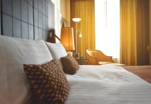
While all the above information is important, make sure only some of it is on the front page and the rest easily accessible by links. Not only would cramming it all on make the page look cluttered, but it would use up space that should be taken by a prominent photograph. It is very important to have a picture of your hotel on the front page. This not only helps those trying to find it when they arrive in town, but also removes any suspicion that your establishment is not very nice and you are trying to conceal the fact. More importantly, an image that shows the hotel looking neat, pleasant and ideally taken against a blue sky on a sunny day with lots of colourful flowers will immediately make it appear more attractive. This must be supplemented by further pictures of various parts of the hotel, once again to show it in a good light. A gallery of images is one way of doing this, or each page that can be navigated to from the front page should come with its own pictures, such as a cosy, spacious-looking bedroom on the page detailing accommodation and prices. For a more personal touch, you can even include mugshots of yourself and other staff, to add a personal touch and an element of familiarity.
Here comes the neighbourhood
It is not just the hotel itself that should be featured, but images of the local area. If the establishment is by the sea, then such views must be included. It is better still if you can include shots of the view from a room. Similarly, local scenery like lakes, mountains or woodland has to be included, or if you are in the middle of a town show the nearby visitor attractions, grand buildings or shopping street. Of course, such images should also exclude anything not so pleasant nearby – you don’t want to emphasise that. A key tip with pictures is that, unless you are a very skilled photographer, it is wise to use a professional to ensure you get the best shots possible.
Colours and fonts
As mentioned above, the best way to put most people off is by using garish colours that will give website visitors migraines. The best approach, in fact, is to use a consistent colour scheme of two or three hues that do not clash and are not too bright or too dull. Indeed, if your hotel has a particular colour theme within this would be the best one to use on the website. Alongside this, it also looks a great deal neater if the same font is used throughout. It should be simple and easily readable. In short, the most effective website is never too bright or funky, but is easily navigable, has lots of good pictures and is well presented.


