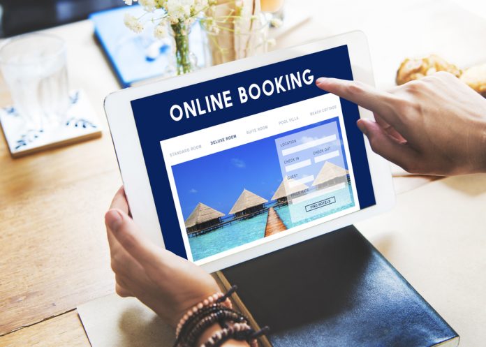
Having a great hotel website is essential in today’s fast-paced, always-online world, but with properties of all sizes now advertising online, it’s essential that yours stands out if it is to attract would-be guests.Modern sites must not only be a shop window for the hotel, but also a marketing tool that acts to get word out there about how fantastic the accommodation is for whatever groups it targets.
So, how can marketers and hotel owners achieve this if they’re not technology experts? What features must hotel websites include to attract travellers who are browsing for their latest break and convince them to press that all-important ‘book now’ button?Here are a few must-haves that all the best brands use – and that you can take advantage of too.
1. Mobile-friendliness According to a study by Statisticbrain, 65 per cent of travellers make same-day reservations for hotels on smartphones – and that’s just those who are booking last-minute trips, never mind those who plan breaks to the nth degree and have their reservations ready months in advance. Furthermore, 67 per cent of people who use mobile for shopping are more likely to buy if a site is seen as mobile-friendly, so functionality and user experience are all-important. You need to make sure your website is optimised to work as well for mobile as it does for the PC, otherwise you could lose valuable custom.One popular technique lately is to design pages for mobiles that have all of the information for the homepage on one long screen that is navigated by scroll (with a ‘return to top’ button for convenience). Although this might seem counter-intuitive and as though it’s an information dump, it actually really suits the Facebook generation who like to scroll rather than having to click through different pages to find the information they want.
2. User-friendliness When people are booking accommodation, they want the experience to be as simple as possible, so cut down the size of any forms you require them to fill in to make a reservation. Some sites make it appear as though guests only need to enter their email address to complete whatever it is they are doing, only to reveal another lengthy form when they click through. Don’t do this, or it might put people off.Similarly, make it easy for users to view dates using a visual calendar. Simple, concise web design makes it easy for would-be guests to find the information they need quickly – and that might make them more open to clicking ‘book now’.Another good point here is that you can cater for different groups at different times of year, as some big brands are already doing. For example, one chain has pictures and content geared towards twenty-somethings in winter when the ski season is in full swing, but then switches its focus towards families in summer when the resort changes gear after the snow has gone. It helps with emotional engagement and allows people to see themselves at your hotel.
3. Aesthetically pleasing Descriptive text can only work so well for hotels, as the travel industry is all about imagery and daydreaming. As such, you need to make your website look great using plenty of image galleries, maps and the promise of location-based services.Try a technique being used by some of the world’s best hotels and have your beautiful pictures stretching the length and breadth of the homepage to really evoke a sense of place.
4. Social media-friendliness Hotel digital marketing is all-important in the 21st century and that means having a presence on social media. Facebook and Twitter now regularly double as customer service tools, while Instagram is one big visual advertisement for travel destinations.You must make the most of social media as a marketing tool by having a clear strategy that works alongside your website to promote your hotel as a great place to be. Don’t forget to include user-generated content too, such as reviews and blogs that talk about your property in a positive light.
5. Connected to a good booking engine If you’ve gone to all this effort to make sure your website is doing all it can to boost conversions, then don’t let it down with a bad booking engine. When people click through and prepare to get their credit cards out, they need to see pages that match the branding they have seen so far, offer a quick and easy transaction and reassure them that their details are safe. We’ve written in detail on this topic before, so do check out archives if you want a more in-depth look at how to get your booking engine in tip-top condition.So, make your hotels’ website responsive, easy to use, attractive to look at and part of a wider marketing effort to ensure higher conversion numbers, better sales and improved guest satisfaction.


