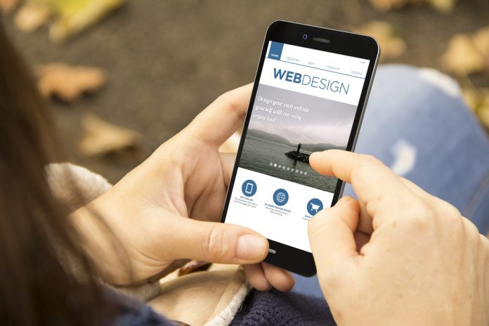
The advent of smartphones that are as powerful as desktop computers has completely revolutionised the way people use the internet. No longer are we confined to the spare room or a corner of the living room as we wait to view travel websites and pictures of hotels on clunky old PCs. We are now part of an ‘always on’ culture, which means people are browsing the internet on their daily commute, during their working day in the office lunch hour and even at home when they are watching TV or eating their evening meal. This has resulted not just in huge changes for retailers, but also for travel companies including hotel owners.
Indeed, the 2015 Travel Flash Report from Criteo found that mobile’s share of bookings in the travel sector had grown from 12 per cent to 23 per cent in a year. Smartphones accounted for 47 per cent of same-day hotel bookings and tablets for a further 11 per cent, the report – which analysed more than a billion bookings – discovered. In most western nations, the share of bookings coming from mobile devices is more than 20 per cent, while it is significantly more in selected others. However, the report also found that many companies are failing to accurately acknowledge the role of mobile in the buying process, particularly when the final transaction takes place on a new device after initial research on a smartphone. How can mobile website design help? There are many different factors that can affect how successful a hotel’s website is in terms of converting looking to bookings, plenty of which hotel marketers will already be well on top of. But one aspect is the actual design of the site and how well it responds to the user – what kind of user experience does it give them? To look into this, we need to consider responsive versus adaptive web design and how it applies to hotels and the world of travel. Defining responsive and adaptive design The phrase ‘responsive web design’ was coined in 2010 in an A List Apart article written by Ethan Marcotte, and it refers to the way a site responds to the size of a browser at any given point.
Meanwhile, ‘adaptive web design’ was conceived by Aaron Gustafson and relates to how sites adapt to the width of a browser at specific points in the viewing experience, at which stage the layout of the page will be altered.Both designs are the same in that they both take browser environment into account and change appearance. However, responsive layouts will fluidly change depending on the size of the screen, which means that all the same elements that exist on a desktop PC will still be there.On the contrary, adaptive web design means the website content will be customised depending on whether the user is on a PC, a mobile or a tablet – each one has its own template. Pros and consAs with most decisions, there will be advantages and disadvantages to both options. For faster speeds and load times, relevance and good conversion rates, adaptive will probably be the best, particularly for luxury or boutique hotels that want custom design and a really engaging experience.
However, when people use smartphones that are a different size than your templates, it may mean they see very wide margins or content that can only be viewed when they scroll from side to side, which can be annoying and might result in someone abandoning a booking.A responsive design is good for future-proofing in case new devices come on the market in the coming years and completely change the browsing experience, but it would require more time and effort in terms of development from your IT team.
In addition, hotel websites with lots of images and graphics might take longer to load up where responsive design is concerned, so you could run the risk of making viewers impatient and less likely to book a stay.Which to go for?In the end, it’s up to you to weigh up the pros and cons and decide on which type of design is best for your hotel. However, the general consensus seems to be that if you have a simple site with less than around 25 pages of content, you should be OK with responsive.
On the other hand, if you have a complex product offering, multiple pages of image-rich content and own a premium property that you really want to show off, then adaptive could well be the best bet for you.Why design is too important to ignore Remember that if you are going to drive mobile bookings onwards and upwards, then the look of your hotel’s website is too important to be ignored. After all, if your site is poorly optimised and looks poor in comparison with a competitor nearby, then you run the risk of your would-be guests going with them and not you for their next holiday or business trip.
Also, if you are to avoid slipping down the rankings and falling behind.Another key point is that you need to be appealing to people all over the world, which means focusing on mobile for some countries. Indeed, for many would-be travellers in developing nations, a smartphone is their only connection to the internet as opposed to being a luxury that’s an add-on to a home-based PC. It’s vital to appeal to them.To sum up, whether you’re going for responsive or adaptive website design for hotels, make sure that:
• All adverts on your site are mobile and tablet-friendly (no miniscule text, please)• You create interest around offers using special landing pages
• You utilise videos and imagery to the maxWith people now more willing than ever to make a smartphone their first port of call as they search for hotels, it’s up to you to offer them the best possible user experience.


